Wiki
FTheme is an open-source Flex 4 look and feel customization library. It provides a special Flex theme that changes components appearance dynamically.
- What is the difference between FTheme and Spark theme?
- What if I just want to change some backgrounds?
- Show me an example of look.
- How to manage looks that are available for the application?
- How does FTheme work?
- What properties and values are supported in look?
What is the difference between FTheme and Spark theme?
- FTheme allows to use unlimited amount of actual looks
- Looks will work for future versions of your app and Flex SDK too
- There will be a great amount of nice looks because it's fairly easy to create a look
What if I just want to change some backgrounds?
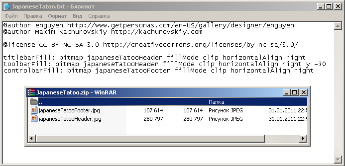
That's the way most looks are created. Here is a sample look JapaneseTatoo, note that
fills reference bitmaps from ZIP archive:
So here are the simple look creation steps:
- Create
MyLook.txtfile and specify some fills or other styles - If you use bitmap fills, place bitmaps with corresponding names in ZIP archive
MyLook.zip. Note: do not apply compression to the archive, use STORE mode. We cannot yet decompress archives but we can read uncompressed ones. - Upload look to the gallery
OR
Save it in near your app SWF and add it to yourlookLinks.xml
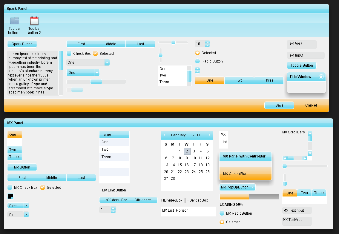
Show me an example of look.
@author Maxim Kachurovskiy http://kachurovskiy.com
@author Harish Sivaramakrishnan http://scalenine.com/

@license CC BY-NC 2.5 http://creativecommons.org/licenses/by-nc/2.5/

color: 0x000000
rollOverColor: 0xC0EBF5
selectionColor: 0xFEA500
errorColor: 0xCC0000
applicationFill: 0x1F1F1F
panelFill: 0xF0F0F0
panelCornerRadius: 7
panelStroke: 0xFFFFFF alpha 0.8
progressBarFill: 0xF5DFBC 0xF9CE86 ratio 0.5 0xF8BF5B ratio 0.51 0xFEA500
progressBarStroke: 0xFFFFFF
progressBarHeight: 20
buttonUpFill: 0xC0EBF5 0xA5E5F4 ratio 0.5 0x8ADEF1 ratio 0.51 0x67D7EF
buttonOverFill: 0xC0EBF5 0xA5E5F4 ratio 0.5 0x8ADEF1 ratio 0.51 0x67D7EF
buttonDownFill: 0xF5DFBC 0xF9CE86 ratio 0.5 0xF8BF5B ratio 0.51 0xFEA500
buttonSelectedFill: 0xF5DFBC 0xF9CE86 ratio 0.5 0xF8BF5B ratio 0.51 0xFEA500
buttonDisabledFill: 0xDDDDDD
buttonStroke: 0xFFFFFF
borderStroke: 0xFFFFFF
buttonCornerRadius: 5
buttonMinWidth: 100
buttonMinHeight: 25
checkBoxSize: 18
headerFill: 0xC0EBF5 0xA5E5F4 ratio 0.5 0x8ADEF1 ratio 0.51 0x67D7EF
headerColors: 0xC0EBF5 0x67D7EF
radioButtonSize: 18
radioButtonDotSize: 8
inputFill: 0xE4E5E5
inputStroke: 0xE1E2E2
inputCornerRadius: 5
scrollBarButtonSize: 0
scrollBarSize: 17
hScrollBarThumbUpFill: 0xC0EBF5 0xA5E5F4 ratio 0.5 0x8ADEF1 ratio 0.51 0x67D7EF
hScrollBarThumbOverFill: 0xC0EBF5 0xA5E5F4 ratio 0.5 0x8ADEF1 ratio 0.51 0x67D7EF
hScrollBarThumbDownFill: 0xF5DFBC 0xF9CE86 ratio 0.5 0xF8BF5B ratio 0.51 0xFEA500
vScrollBarThumbUpFill: 0xC0EBF5 0xA5E5F4 ratio 0.5 0x8ADEF1 ratio 0.51 0x67D7EF rotation 0
vScrollBarThumbOverFill: 0xC0EBF5 0xA5E5F4 ratio 0.5 0x8ADEF1 ratio 0.51 0x67D7EF rotation 0
vScrollBarThumbDownFill: 0xF5DFBC 0xF9CE86 ratio 0.5 0xF8BF5B ratio 0.51 0xFEA500 rotation 0
hScrollBarTrackFill: 0xE4E5E5
vScrollBarTrackFill: 0xE4E5E5
scrollBarCornerRadius: 4
scrollBarStroke: 0xFFFFFF
scrollBarThumbMinSize: 40
symbolColor: 0xFFFFFF
symbolFill: 0xFFFFFF
sliderTrackFill: 0xE4E5E5
sliderTrackSize: 9
sliderTrackStroke: 0xFFFFFF
sliderThumbSize: 15
titlebarFill: 0xC0EBF5 0xA5E5F4 ratio 0.5 0x8ADEF1 ratio 0.51 0x67D7EF
titlebarStroke: 0xFFFFFF
toolbarFill: 0xAEE7F5 0xC5EDF7 ratio 0.4 0xB1E7F4 ratio 0.41 0xBFEAF4
toolbarStroke: 0xFFFFFF
controlbarFill: 0xF5DFBC 0xF9CE86 ratio 0.5 0xF8BF5B ratio 0.51 0xFEA500
controlbarStroke: 0xFFFFFF
contentFill: 0xFFFFFF
contentStroke: 0xFFFFFF
How to manage looks that are available for the application?
Controller options
FThemeController constructor accepts one optional parameter options:FThemeOptions.
It provides the following properties:
lookLinksXMLURL:Stringdefault URL for the file with look links XML file. Setting it e.g. tomyLookLinks.xmlwill cause manager to load and use that file.lookLinkNames:Array of Stringarray of look names. Look files are loaded fromLookName.txtandLookName.zipURLs.lookLinksURLBase:Stringis used whenlookLinkNamesare specified and is added to look file URLs e.g. iflookLinkNamesis["Plastic", "Sky"/code> andlookLinksURLBaseis"/app/looks/"then look files are loaded from"/app/looks/Plastic.txt"and"/app/looks/Sky.txt".showDefaultLookis true by default and allows user to select default look inLookSelectorUI component.
Specifying controller options via FlashVars
If options were not passed in controller constructor FlashVars are checked. The same options can be specified there:
<script type="text/javascript">
var flashvars =
{
	lookLinksXMLURL: "/swf/lookLinks.xml",
	// lookLinkNames: "Plastic,Sky,Red",
	// lookLinksURLBase: "/some/dir/",
	// showDefaultLook: "false"
};
swfobject.embedSWF("/swf/app.swf", "swfContainer", "100%", "450", "10.1",
	"/playerProductInstall.swf", flashvars);
</script>
<div id="swfContainer">
Default behavior - load lookLinks.xml
If controller options were not specified and FlashVars are empty then FTheme tries to
load XML file lookLinks.xml and expects to get this:
<lookLinks>
	<lookLink name="Plastic"/>
	<lookLink name="Yakuza"/>
	<lookLink name="Red"/>
	...
</lookLinks>
<lookLink> node can also have the following attributes:
txtFileURL- URL to look txt file. If not specifiedName.txtis usedzipFileURL- URL to look zip file. If not specifiedName.zipis used if look has bitmap fills.
How does FTheme work?
It works nearly the same way as default spark.swc or wireframe.swc
via defining skin for each component like Button, CheckBox and so on.
The key difference is that FTheme does not define the actual pixels, they are
drawn by fills and strokes that are generated at runtime.
Compare ButtonSkin in two themes:
| Spark | FTheme |
|---|---|
<!-- layer 1: shadow --> <!--- @private --> <s:Rect id="shadow" left="-1" right="-1" top="-1" bottom="-1" radiusX="2"> <s:fill> <s:LinearGradient rotation="90"> <s:GradientEntry color="0x000000" color.down="0xFFFFFF" alpha="0.01" alpha.down="0" /> <s:GradientEntry color="0x000000" color.down="0xFFFFFF" alpha="0.07" alpha.down="0.5" /> </s:LinearGradient> </s:fill> </s:Rect> <!-- layer 2: fill --> <!--- @private --> <s:Rect id="fill" left="1" right="1" top="1" bottom="1" radiusX="2"> <s:fill> <s:LinearGradient rotation="90"> <s:GradientEntry color="0xFFFFFF" color.over="0xBBBDBD" color.down="0xAAAAAA" alpha="0.85" /> <s:GradientEntry color="0xD8D8D8" color.over="0x9FA0A1" color.down="0x929496" alpha="0.85" /> </s:LinearGradient> </s:fill> </s:Rect> <!-- layer 3: fill lowlight --> <!--- @private --> <s:Rect id="lowlight" left="1" right="1" top="1" bottom="1" radiusX="2"> <s:fill> <s:LinearGradient rotation="270"> <s:GradientEntry color="0x000000" ratio="0.0" alpha="0.0627" /> <s:GradientEntry color="0x000000" ratio="0.48" alpha="0.0099" /> <s:GradientEntry color="0x000000" ratio="0.48001" alpha="0" /> </s:LinearGradient> </s:fill> </s:Rect> <!-- layer 4: fill highlight --> <!--- @private --> <s:Rect id="highlight" left="1" right="1" top="1" bottom="1" radiusX="2"> <s:fill> <s:LinearGradient rotation="90"> <s:GradientEntry color="0xFFFFFF" ratio="0.0" alpha="0.33" alpha.over="0.22" alpha.down="0.12"/> <s:GradientEntry color="0xFFFFFF" ratio="0.48" alpha="0.33" alpha.over="0.22" alpha.down="0.12" /> <s:GradientEntry color="0xFFFFFF" ratio="0.48001" alpha="0" /> </s:LinearGradient> </s:fill> </s:Rect> <!-- layer 5: highlight stroke (all states except down) --> <!--- @private --> <s:Rect id="highlightStroke" left="1" right="1" top="1" bottom="1" radiusX="2" excludeFrom="down"> <s:stroke> <s:LinearGradientStroke rotation="90" weight="1"> <s:GradientEntry color="0xFFFFFF" alpha.over="0.22" /> <s:GradientEntry color="0xD8D8D8" alpha.over="0.22" /> </s:LinearGradientStroke> </s:stroke> </s:Rect> <!-- layer 6: highlight stroke (down state only) --> <!--- @private --> <s:Rect id="hldownstroke1" left="1" right="1" top="1" bottom="1" radiusX="2" includeIn="down"> <s:stroke> <s:LinearGradientStroke rotation="90" weight="1"> <s:GradientEntry color="0x000000" alpha="0.25" ratio="0.0" /> <s:GradientEntry color="0x000000" alpha="0.25" ratio="0.001" /> <s:GradientEntry color="0x000000" alpha="0.07" ratio="0.0011" /> <s:GradientEntry color="0x000000" alpha="0.07" ratio="0.965" /> <s:GradientEntry color="0x000000" alpha="0.00" ratio="0.9651" /> </s:LinearGradientStroke> </s:stroke> </s:Rect> <!--- @private --> <s:Rect id="hldownstroke2" left="2" right="2" top="2" bottom="2" radiusX="2" includeIn="down"> <s:stroke> <s:LinearGradientStroke rotation="90" weight="1"> <s:GradientEntry color="0x000000" alpha="0.09" ratio="0.0" /> <s:GradientEntry color="0x000000" alpha="0.00" ratio="0.0001" /> </s:LinearGradientStroke> </s:stroke> </s:Rect> <!-- layer 7: border - put on top of the fill so it doesn't disappear when scale is less than 1 --> <!--- @private --> <s:Rect id="border" left="0" right="0" top="0" bottom="0" width="69" height="20" radiusX="2"> <s:stroke> <s:LinearGradientStroke rotation="90" weight="1"> <s:GradientEntry color="0x000000" alpha="0.5625" alpha.down="0.6375" /> <s:GradientEntry color="0x000000" alpha="0.75" alpha.down="0.85" /> </s:LinearGradientStroke> </s:stroke> </s:Rect> <!-- layer 8: text --> <!--- @copy spark.components.supportClasses.ButtonBase#labelDisplay --> <s:Label id="labelDisplay" textAlign="center" verticalAlign="middle" maxDisplayedLines="1" horizontalCenter="0" verticalCenter="1" left="10" right="10" top="2" bottom="2"> </s:Label> |
<s:Rect left="1" right="1" top="1" bottom="1" fill.up="{getStyle('buttonUpFill')}" fill.over="{getStyle('buttonOverFill')}" fill.down="{getStyle('buttonDownFill')}" fill.disabled="{getStyle('buttonDisabledFill')}" radiusX="{getStyle('buttonCornerRadius')}"/> <s:Rect left="1" right="1" top="1" bottom="1" stroke="{getStyle('highlightStroke')}" radiusX="{Math.max(0, getStyle('buttonCornerRadius') - 1)}"/> <s:Rect left="0" right="0" top="0" bottom="0" stroke="{getStyle('buttonStroke')}" radiusX="{getStyle('buttonCornerRadius')}"/> <s:Label id="labelDisplay" textAlign="center" verticalAlign="middle" maxDisplayedLines="1" horizontalCenter="0" verticalCenter="1" left="10" right="10" top="2" bottom="2"/> |
As you see FTheme skin uses styles like buttonUpFill that is
mx.graphics.IFill instance and buttonStroke that is
mx.graphics.IStroke. That's what FTheme does - sets those styles
to .global CSS style declatation inside Flex StyleManager.
What properties and values are supported in look?
Here is the list of currently supported look properties:
- alternatingItemColors Array of colors Corresponds to Flex SDK "alternatingItemColors" style for list items backgrounds.
- applicationFill Fill Application background fill.
- borderStroke Stroke General stroke that is used in MX components borders and in other components that do not have implicit borders (like inputs that have "inputStroke").
- borderStroke Stroke General border. Also sets "borderColor" and "borderAlpha" Flex SDK styles.
- buttonCornerRadius Number Various buttons border corner radius.
- buttonDisabledFill Fill Various buttons disabled fill.
- buttonDownFill Fill Various buttons down fill.
- buttonMinHeight Number Button min height. Default is 21.
- buttonMinWidth Number Button min width. Default is 21.
- buttonOverFill Fill Various buttons over fill.
- buttonSelectedFill Fill Various buttons selected fill.
- buttonStroke Stroke Various buttons border stroke.
- buttonUpFill Fill Various buttons up fill.
- checkBoxSize Number Check box width and height. Default is 13.
- color null Text color in the application.
- contentCornerRadius Number Content areas border corner radius.
- contentFill Fill Content areas background fill e.g. list background fill.
- contentStroke Stroke Content areas border stroke.
- controlbarColor Color Controlbar text color.
- controlbarFill
Fill
Controlbaris a component introduced by FTheme is much likemx:ControlBarbut it can be placed everywhere in the application. Background fill. - controlbarStroke Stroke Controlbar top border stroke.
- errorColor Color Error text color.
- hScrollBarThumbDownFill Fill
- hScrollBarThumbOverFill Fill
- hScrollBarThumbUpFill Fill
- hScrollBarTrackFill Fill
- headerColors
Array of colors
Array of 2 colors for
mx:DateChooserheader fill. - headerFill Fill Data grid and some other components header fill.
- highlightStroke Stroke Stroke that goes right next to the common interactive component border. Default is "0xFFFFFF alpha 0.2"/span>
- inputCornerRadius Number Various inputs border corner radius.
- inputFill Fill Various inputs background fill.
- inputStroke Stroke Various inputs border stroke.
- panelCornerRadius Number Panel corner radius.
- panelFill Fill Panel content area background fill.
- panelStroke Stroke Panel border stroke.
- progressBarFill Fill Progress bar fill.
- progressBarHeight Number Progress bar height.
- progressBarStroke Stroke Progress bar border stroke.
- progressBarTrackFill Fill Progress bar track fill.
- radioButtonDotSize Number Radio button dot size. Default is 5
- radioButtonSize Number Radio button width and height. Default is 13
- rollOverColor Color Background color for hovered item renderers.
- scrollBarButtonSize Number Defailt is 17.
- scrollBarCornerRadius Number Defailt is 0.
- scrollBarSize Number Defailt is 14.
- scrollBarStroke Stroke
- scrollBarThumbMinSize Number Defailt is 17.
- selectionColor Color Background color for selected item renderers.
- sliderThumbSize Number Defailt is 11.
- sliderTrackCornerRadius Number Defailt is 3.
- sliderTrackFill Fill
- sliderTrackSize Number Defailt is 6.
- sliderTrackStroke Stroke
- symbolColor Color
- symbolFill Fill
- titlebarColor Color Titlebar text color.
- titlebarFill Fill Titlebar fill. Titlebar is the topmost area of panel with panel title inside.
- titlebarStroke Stroke Titlebar bottom border stroke.
- toolbarButtonDisabledFill Fill Toolbar button disabled background fill.
- toolbarButtonDownFill Fill Toolbar button down background fill.
- toolbarButtonOverFill Fill Toolbar button over background fill.
- toolbarButtonUpFill
Fill
ToolbarButtonis a component introduced by FTheme. Button up background fill. - toolbarColor Color Toolbar text color.
- toolbarFill
Fill
Toolbar background fill.
Toolbaris a component introduced by FTheme. Is usually placed right below the panel titlebar. - toolbarStroke Stroke Toolbar bottom border stroke.
- vScrollBarThumbDownFill Fill
- vScrollBarThumbOverFill Fill
- vScrollBarThumbUpFill Fill
- vScrollBarTrackFill Fill
Types
Number
Simple number text form is supported e.g.buttonCornerRadius: 4
Color
The following string color representations are supported:0xFFCC00#FFCC000x333#333
Array of colors
List of colors separated by spaces:0xFFCC00 0xFF0000 0xCC5500#333 #2220x333
Fill
Linear or solid color fill
0xFFCC000xFFCC00 alpha 0.50xFFCC00 0xFF0000 rotation 450xFFCC00 alpha 0.5 ratio 0.2 0xFF0000 alpha 0.85 spreadMethod reflect scaleX 150
Valid values of spreadMethod are pad, reflect and repeat.
Default rotation is 90 so that gradient draws vertically.
Radial fill
radial 0xFFCC00radial 0xFFCC00 alpha 0.5radial 0xFFCC00 0xFF0000 rotation 45 scaleX 100 scaleY 200 focalPointRatio -1
Valid values of spreadMethod are pad, reflect and repeat.
Default rotation is 90.
Valid values of focalPointRatio are from -1.0 to 1.0.
Bitmap fill
bitmap assetIdbitmap assetId fillMode clip horizontalAlign right verticalAlign bottom smooth truebitmap assetId fillMode clip horizontalAlign right y -30bitmap assetId fillMode scale maintainAspectRatio true
Before specifying bitmap fill ensure that you've got bitmaps with corresponding names in your ZIP archive:
Stroke
Only solid strokes withalpha and pixelHinting are supported..
0xFFCC00#333 alpha 0.5 pixelHinting true